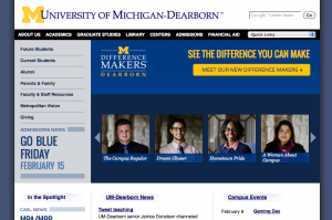
That was the message presented to students, faculty and staff members last month when the university’s digital team unveiled concepts for the new homepage.
“There’s a desire to have your web presence tell your story,” said Laura Garling, digital project manager. “It’s a much more personal way to engage, and it’s much more reflective of who we are as a campus.”
The digital team began the redesign process with a discovery and research phase. They set out to learn how university members view campus and how they’d like to see campus presented digitally.
Common themes developed when asked to define UM-Dearborn—diverse, hard working, inclusive, regionally focused, close-knit, serious. When asked how they would like to see the university’s web presence presented, the digital team heard some familiar phrases—clean, crisp, direct, inviting—and some unexpected—edgy, surprising.
The digital team used those phrases to create a homepage that encompasses the university experience.
“The feedback we’ve received from campus has been largely positive,” Garling said. “It’s exciting to see the enthusiasm build.”
The homepage reveal was the first tangible delivery of the university’s web redesign, Garling noted, calling it a “big step in a much bigger process.”
The larger project will focus on three outcomes:
- A refreshed web presence that maximizes usability, balances consistency and customization and is accessible to mobile devices and those with disabilities;
- A strong platform that possesses a shared arsenal of technologies and offers an effective and easy-to-use content management system backed by a strong user community;
- A solid process that defines and advocates standards, policies and best practices in a shareable format.
“It’s about choosing the right platform to create the right presence to showcase our robust community,” Garling said.
The campus community can expect email status updates as the project moves forward.

