This article was originally published on April 14, 2021.
Distracted driving is typically associated with cell phones. But functionally, the oversized touchscreens in car infotainment systems aren’t all that different. Manufacturers and regulators know this and try to limit how distracting these built-in systems are by making certain functions off-limits during driving. But the design of infotainment systems is also an important safety factor, since more intuitive systems mean drivers spend less time with their eyes and minds on the screens.

Everything from the arrangement and size of touchscreen icons to color choices can make a difference, according to UM-Dearborn master’s student Hyunjoo Park. Park, who was a graphic designer before she started her program in Human-Centered Design Engineering, is especially interested in an often overlooked aspect of infotainment design: text. In particular, she’s researching whether things like fonts, text size and line spacing can impact our ability to comprehend information while also paying attention to the road.
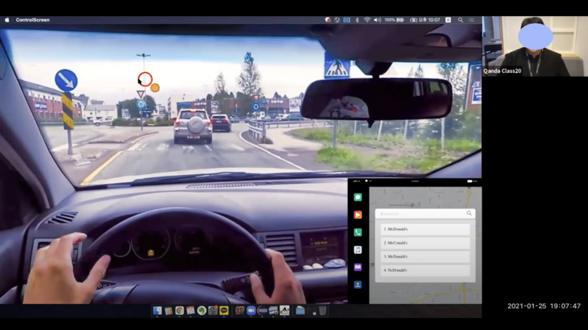
To do this, Park designed several experiments that measured participants’ abilities to do a primary task requiring driverlike attention, while also completing a secondary task that simulated interaction with an infotainment system. In one experiment, people were asked to use their mouses to continuously follow a small orange dot moving across a computer screen that featured a simulated driving experience. While they were doing this, Park then prompted them with a secondary infotainment screen featuring a multiple choice question. The answers were four close spelling variations of a single word, but only one choice featured the correct spelling. Park recorded both how long it took participants to choose the correct answer and how well they tracked the orange dot while interacting with the on-screen question. She repeated the experiment using infotainment text formats mimicking four actual manufacturer systems.
A second experiment asked the participants to complete the same follow-the-orange-dot primary task. But this time, the secondary task consisted of reading a longer text infotainment message made up of several sentences. The participants were then quizzed for comprehension. Again, Park repeated the experiment for different manufacturer text formats — and as a follow-up, did a version of the experiment with different line spacings.

The results were both revealing and complicated. In the first experiment, Park says there was a significant performance difference between manufacturer systems — both in terms of the time it took people to pick out the correct spelling and their abilities to track the orange dot while doing so. In the second experiment, however, there was no noticeable difference in comprehension or dot-tracking performance between the manufacturer systems. Further muddying the waters — line spacing did matter. The widest line spacing led to the best comprehension and performance.
Park says these nuanced results show just how complicated our experiences of text are — and indicate that a lot of further study is needed to determine which text attributes are important to each specific infotainment task. Solving those puzzles could result in safer vehicle infotainment systems in the future, and Park may get a chance to do some of that work herself. After graduation, she hopes to continue working on user experience problems as a design engineer in the automotive field.
###
Hyunjoo Park is a master’s student in UM-Dearborn’s Human-Centered Design Engineering (HCDE) program. If you think you might be interested in solving problems like this, browse the full program description, or check out the recently launched HCDE undergraduate program.


