Logos
Logo Standards
 You can now browse and download logos directly through Google Drive.
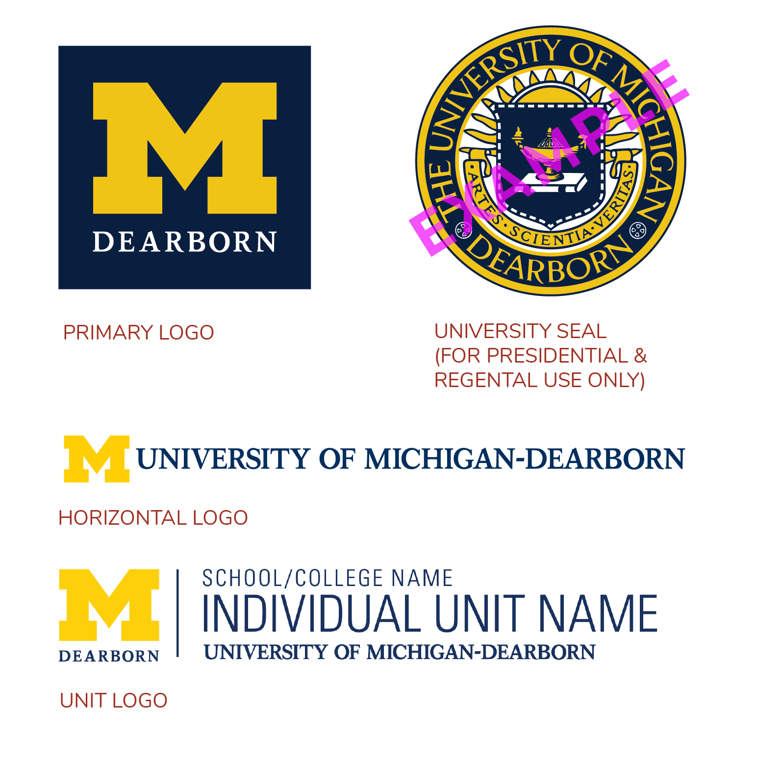
University of Michigan-Dearborn has three official marks — the primary logo, the horizontal logo and the university seal. The primary logo may be used widely, while the university seal is reserved for presidential/chancellor and regental use only. The University of Michigan-Dearborn logo was carefully designed based on the pro - portions of the copyrighted Block M. Each element was sized, placed and colored for maximum visibility and legibility. The UM-Dearborn logo is part of a family of logos across three campuses, medical system and athletics program. The primary logo is the main identifier for University of Michigan-Dearborn. The primary logo, horizontal logo or unit logo must appear on all publications, websites and other visual communications developed for UM-Dearborn. Logo(s) should be easily found and read by the viewer. Horizontal logos work well running across the top, while “Block M” logos tend to look best placed at the bottom of a piece. The university seal may only be used on Regental or Chancellor communications. The Block M cannot be used as a letter in a word.
Clear Space
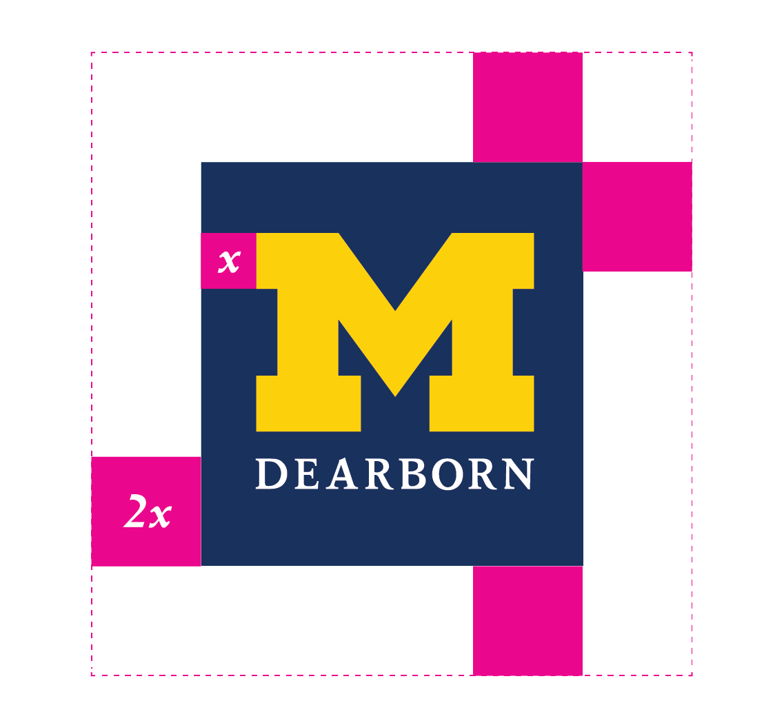
Always position the logo for maximum impact and give it plenty of room to help to ensure visibility and legibility. The minimum clear space for the University of Michigan-Dearborn logo is defined as twice the height (2x) of the Block M’s serif (x). Understanding the clear-space rule is essential, as it is also the standard for logo position and scale on most printed communications. In that regard, the clear space rule should be maintained as the logo is proportionately enlarged or reduced in size
Minimum Sizes

When reproducing the primary logo, be conscious of its size and legibility. The primary logo should never appear less than 3/4” tall in printed materials, and no less than 75 px tall in the digital realm. A logo signature may be reduced 3/8” tall in print, and 36 px digitally
Logo Infractions
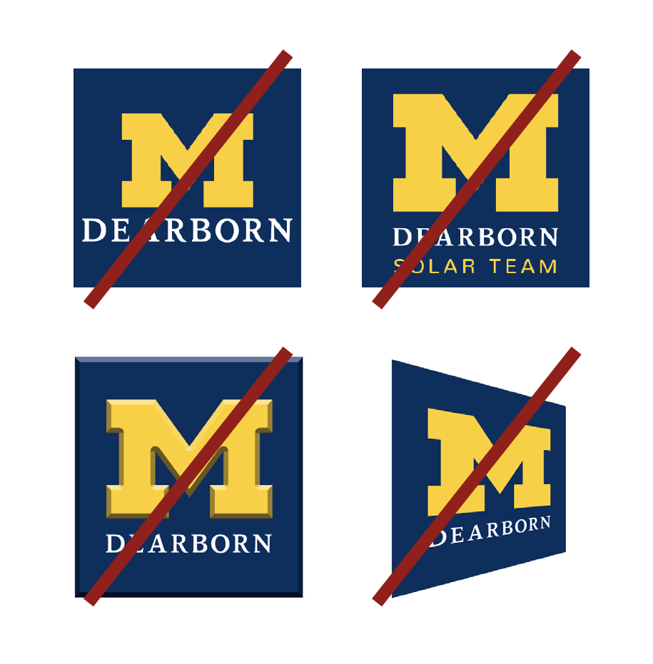
You may not alter the logo in any way. Specifically:
- DO NOT replace the official typeface with any other
- DO NOT modify, redesign, redraw, animate, distort or alter the proportions of the logo
- DO NOT add words, images, or other design elements or effects to the logo, or add the logo to another graphic
- DO NOT modify the size or position relationship of any element within the logo
- DO NOT rotate or render the logo three-dimensionally
How to Write University of Michigan-Dearborn
Correct ways:
- University of Michigan-Dearborn
- UM-Dearborn
Incorrect ways:
- UMD
- UM-D
- University of Michigan—Dearborn
- University of Michigan - Dearborn
- UofM-Dearborn
- University of Michigan Dearborn Logos and Marks
- UM Dearborn
Unit Logos
The University of Michigan’s identity system is designed to create and maintain unity — to ensure that no matter what campus, college or unit is issuing the communication, it is properly and strongly branded.
Official University of Michigan-Dearborn logos are created and maintained by the Office of External Relations. Logos can be created for colleges, departments and units on campus. Logos are not created for academic programs, unit initiatives or programming.
To request unit logos, or if you have any questions about university logos, please contact the Office of External Relations at um-dearbornbrand@umich.edu.

USAGE
The most formal logo. Use cases can include letterhead and documents for external audiences.

USAGE
Use in situations where internal university hierarchy is not important to the audience. Use cases can include posters and flyers.

Reserved for internal communications or outreach to stakeholders who are already familiar with the unit. Use cases can include an internal communication to faculty and staff or letterhead to recent alumni.
Use in settings where there is limited space and the preferred horizontal mark would not be legible. Use cases can include on the corner of a poster or a small logo printed on a garment.
Sponsored Student Organizations (SSO) are any organization with a formal agreement on file with/approved by the Office of Student Life between organization and a campus office or division, academic department or college.
THESE ORGANIZATIONS MAY:
- use the Block M Dearborn in their promotions
- use University of Michigan-Dearborn as part of their official organization name
- use the Michigan Maize (PMS 7406) and Blue (PMS 282) colors
THESE ORGANIZATIONS MAY NOT:
- alter the Block M Dearborn logo in any way
- use the Victors font
- use the Block M Dearborn in a spelling variation of a word/sentence

Sponsored Student Organizations whose sponsorship is from a college are permitted to use the sponsoring college logo on apparel and in promotions with the club name underneath it in an approved secondary font.
THESE ORGANIZATIONS MAY:
- use the Michigan Maize (PMS 7406) and Blue (PMS 282) colors
THESE ORGANIZATIONS MAY NOT:
- alter the Block M Dearborn logo in any way
- use the Victors font
- use the Block M Dearborn in a spelling variation of a word/sentence

Registered Student Organizations (RSO):
THESE ORGANIZATIONS MAY:
- use the Michigan Maize (PMS 7406) and Blue (PMS 282) colors
- use “University of Michigan-Dearborn” or “UM-Dearborn” (no other variation) at the end of their name
THESE ORGANIZATIONS MAY NOT:
- use the Block M Dearborn logo in any manner
- use the Victors font
